Product design
Atlas
An analytics dashboard reworked so operators see problems before they see charts.
- Client
- Atlas Systems
- Year
- 2024
- Role
- Product design
- Services
- UX, UI, data design
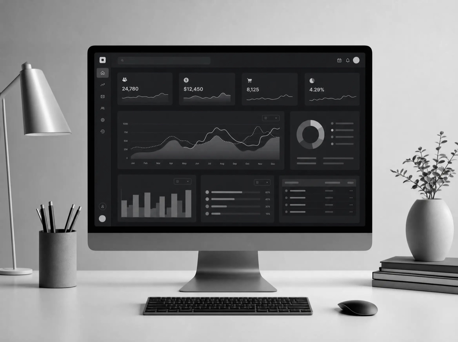
Atlas monitors industrial equipment across hundreds of sites. Its dashboard showed everything and prioritized nothing — operators scanned twelve charts to find the one that mattered.
Exceptions first
We inverted the hierarchy: the default view is a ranked list of things that need attention, each with the single chart that explains it. The full grid still exists, one level down, for the analysts who want it.
A strict data-design language keeps the surface readable at a distance — one alarm color, fixed thresholds, and typography sized for a control room, not a laptop.
The result
Mean time-to-acknowledge dropped from eleven minutes to under two, and Atlas made the exception view the default across its whole product line.